Digging into design systems
They're not just for designers!
It’s time to explore Design Systems
As someone outside design, it can be easy to hear “Design Systems” and think “oh, that’s not for me”. But not so fast!
At the very least, it’s important to understand your team’s Design System, and at best, Design Systems can help any Maker be more consistent, efficient, and polished.
In this post, I’ll share a quick primer on Design Systems along with a couple ideas on ways you can make them work for you.
What are Design Systems?
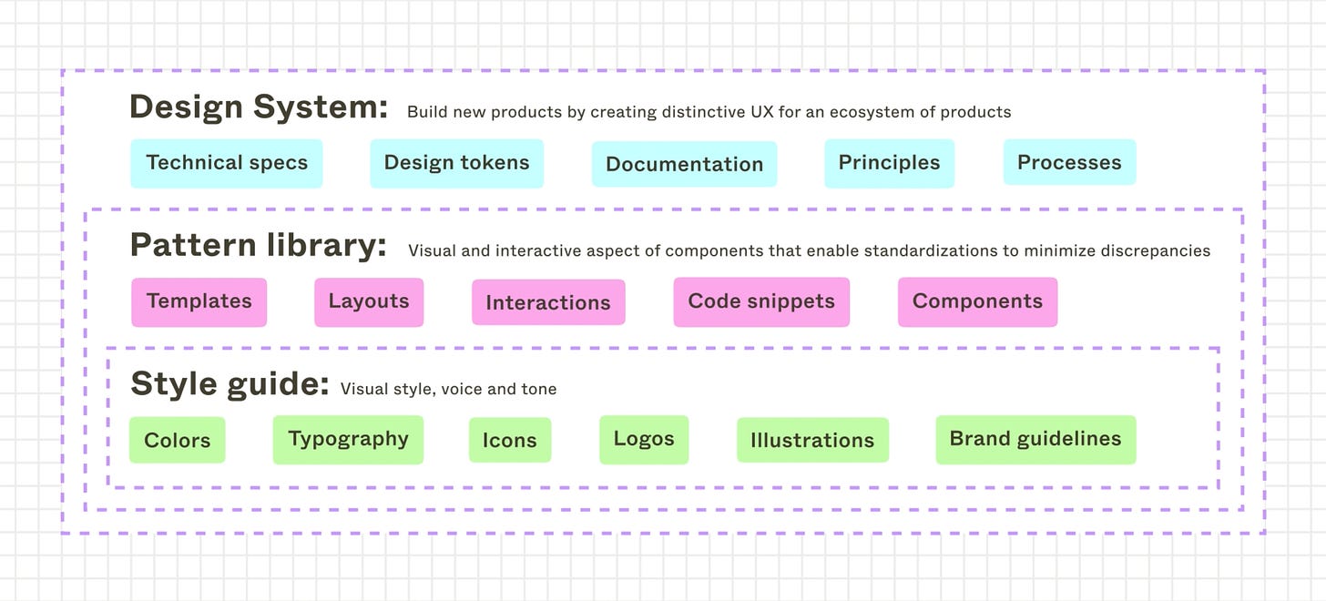
In our Design Systems overview course, Figma explains that design systems provide “the tools and resources you need to build consistent and cohesive products.” It includes the “what”, the “how”, and the “why” of your product’s design including pattern libraries, style guides, documentation, processes and more.
For example, your team’s Design System might include:
What: Buttons, illustrations, and fonts to use in your assets
How: The documentation on correct logo usage
Why: A vision for your brand language that contextualizes your voice and tone guidelines
Why should I care about Design Systems?
Kristina Gudim recently described Design Systems on LinkedIn as the “secret sauce that elevates your entire organization”, and compelled teams to think about how everyone in your organization can use it as a powerful framework.
And I agree! If you contribute to building products for your company, collaborate with designers, or care about creating consistent, cohesive product experiences for your customers, Design Systems can elevate your work.
A strong Design System will contain:
Design principles
Foundational libraries for components, typography, color, and more
Documentation for how to apply the design system
Processes for using, contributing, and maintaining the system
Each of these parts of the system can be useful in any role if you take time to familiarize yourself with the Design System your team has set up.
Where do I find my team’s Design Systems?
As explained above, Design Systems are often more than just assets and styles, and your Design Systems may be captured across a few different tools. You should invest in learning about your company’s design systems to understand how they should be used and applied.
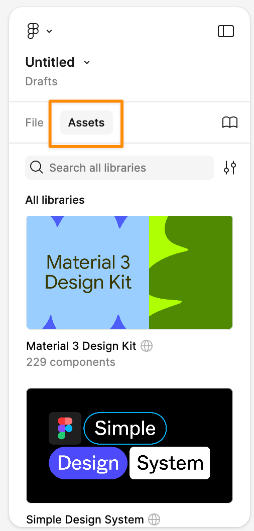
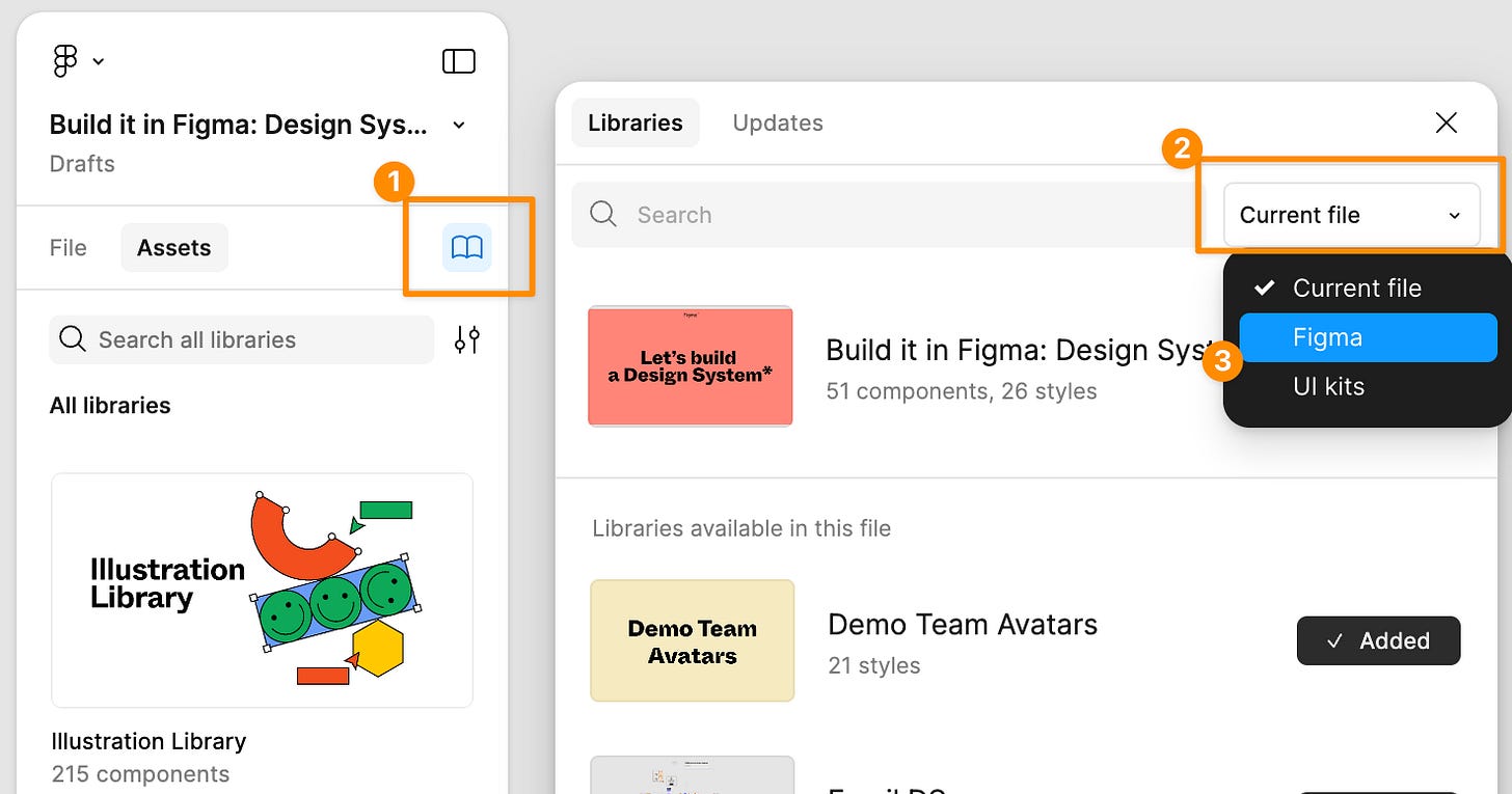
Once your team has published their Design System in Figma, you can find it via the assets panel. Here you’ll be able to access the libraries, components, styles, and assets that have been published.
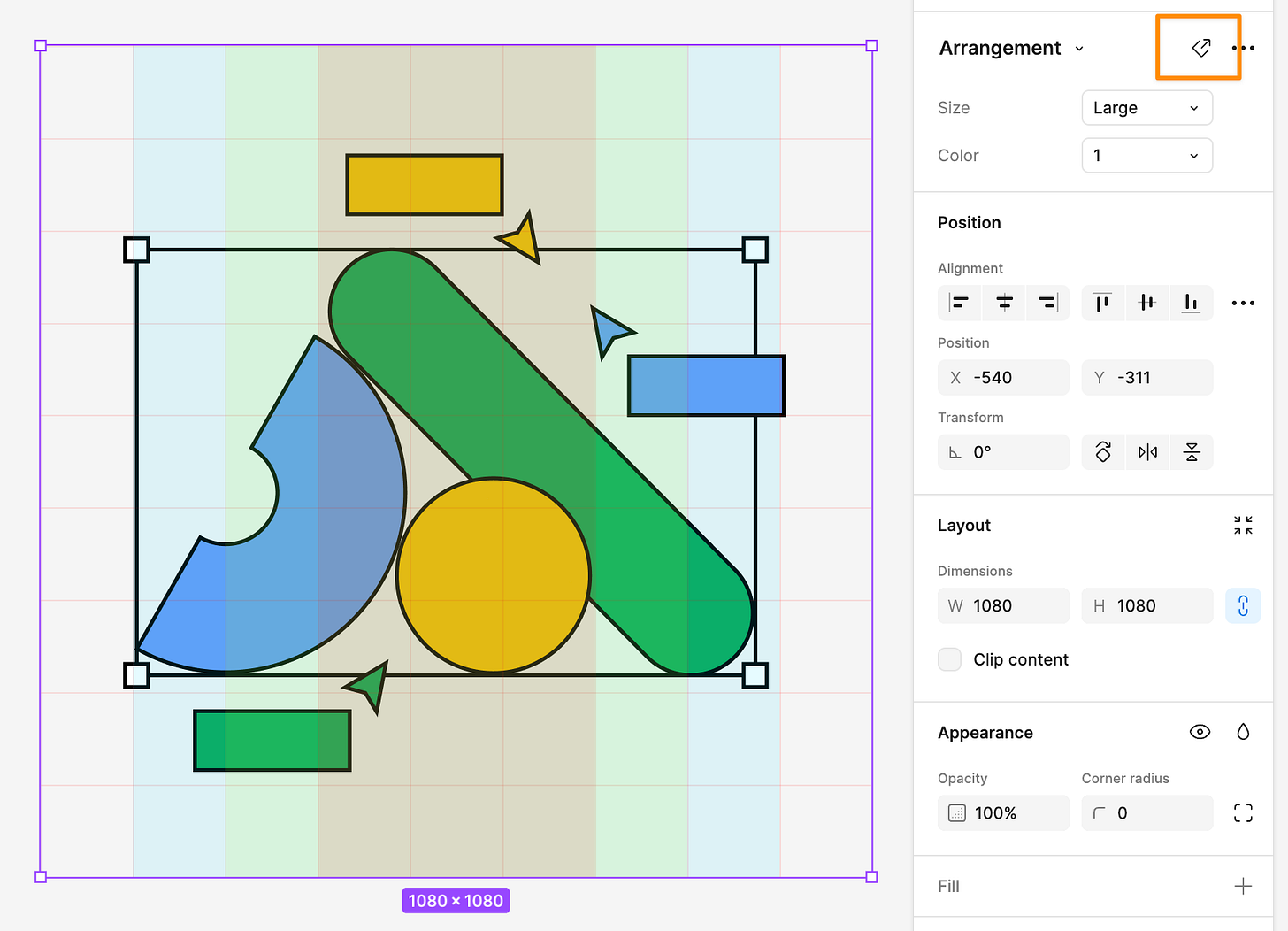
You can insert an instance of any available asset to use it in your design. And if you want view the component in the original source file, you can click out to bring you to the main component in the original library.
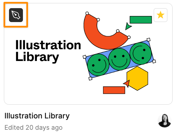
You’ll also notice a different file icon for library files in your organization. You likely won’t be able to edit these files, so you don’t have to worry about messing anything up, but you can browse and pull components from them into your own work.
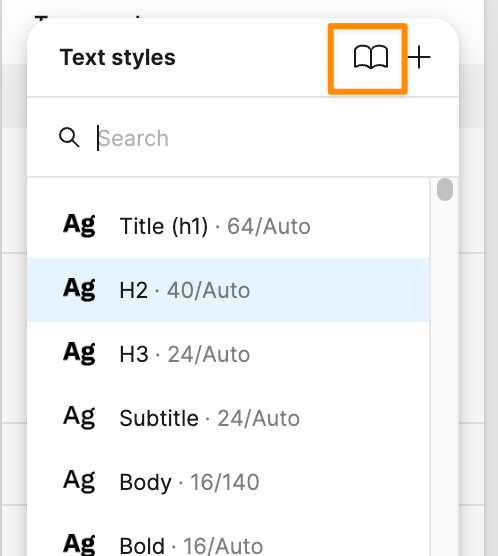
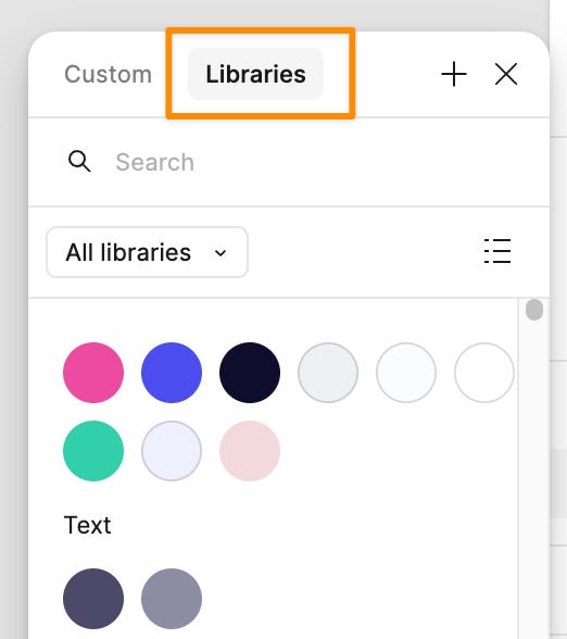
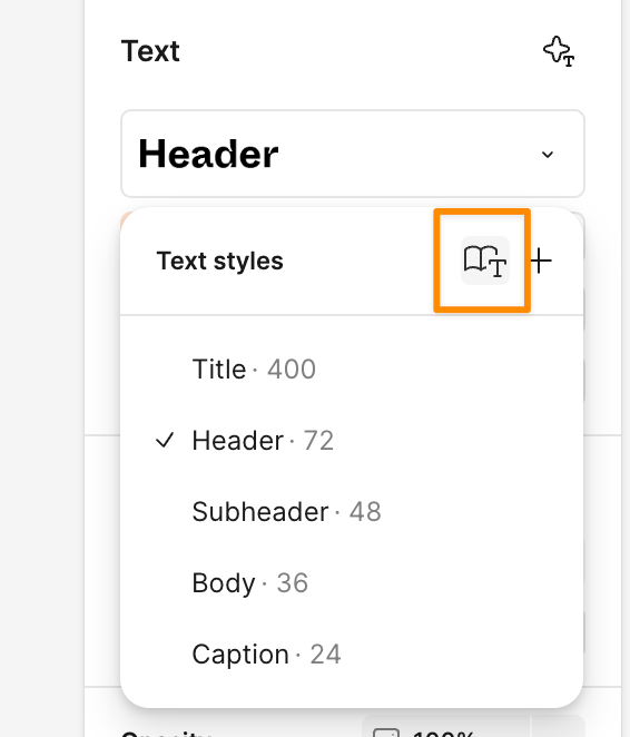
You can also apply styles from your team’s Design Systems by accessing libraries when editing things like text and colors.
How can I use my team’s Design Systems?
At a foundational level, I would recommend using your team’s assets to speed up any design task big or small whether it’s pulling in a logo, adding a button to your FigJam board, or pulling in an illustration to polish up your slides.
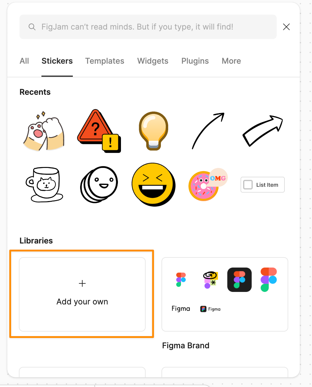
For example, you can pull in assets from your team’s published libraries as stickers in FigJam, which makes it easy to bring in approved logos, buttons, illustrations, and more.
You can also make sure your text and colors are on brand by using the typography styles and color libraries in Figma Slides or Figma Design. When adding a text or shape layer, click on the libraries to select from published styles.
If you want to explore more, try browsing the other available libraries in your organization to see what other assets and styles you have at your finger tips.
There might be many hidden gems that you can use to up-level your creations 💎
And if you’re not working in a team with an established Design System? We’ve got you! I’ll be back next week to introduce you to the new Simple Design System in Figma 😁
📚 Developing our design skills
If you want to go deeper on building design systems, Figma has you covered! We have a wealth of resources to learn more about Design Systems, and these are a few of my favorites:
A helpful primer that goes deeper than the above on what Design Systems are and why they matter
My incredible teammate, Rogie, developed a 5-part course along with an organized Figma community file walking you through everything step-by-step.
Plus, there’s a Let’s build a Design System community file
Intro to Design Systems on Figma Learn
A written guide getting you up to speed on all things Design Systems
A collection of open source design systems from Figma Community. This is a great tool to see other examples of Design Systems that demonstrates there is no “right way” to build them. There are many ways, and the best is what works for you and your team!
This is also part of a larger collection of resources at
Design systems deep dive from Config 2024
This talk given by my incredible teammates, Chad, Ana, and Alexia covers best practices for once you’ve mastered the basics
Big thank you to Lauren Byrne for helping me learn about Design Systems myself and editing this post 🙌🏻
📏 Design principles: Think global
Many of us are motivated by making better products for people. It can be easy to fall into the trap of building for people we already know or love. But when building products, assets, or resources (especially digital ones), we need to think bigger, we need to think global.
So in this week’s design principles to consider are John Saito’s 7 rules for designing with internationalization in mind:
Leave room for longer translations
Avoid putting text in narrow columns
Don’t embed text in images
Don’t create sentences with UI elements
Watch out for metaphors
Use descriptive feature names
Provide alternates for translation
Read John’s full article here.
👋🏻 Meet our makers: Jenny
This week, we get to meet Jenny Xie, a content strategist at Figma to learn about her book, trip planning process, and more!
Learning Figma and FigJam at work
Jenny started using FigJam for swarms and Dwell and has used it for more and more work here at Figma:
Using FigJam for fun!
Jenny also brings the jam outside of work. Watch her walk through her trip planning process to organize a group trip to Costa Rica:
Advice for getting started
She encourages us to get in there and have some fun:
“Allow yourself to be liberated and poke around. Be surprised and tap into your inner childlike state of play and discovery. “
- Jenny Xie, Content Strategist @ Figma
Thanks, Jenny, and cheers to finding a state of play and discovery!


